
The brand process feels slow when you’re impatient to launch. Especially with the compounding reasons to just use AI to make your new logo, flyer or website.
Workshops, research, audience profiling, it can all seem like a delay between you and a new logo.
But those that skip straight to the visuals end up rebuilding from scratch within a few years, usually at greater cost and with more disruption than if they’d done it properly the first time. Even more now with the empowerment that comes with AI prompting .
A thorough brand process produces something the shortcut version never can: a visual identity that genuinely reflects who you are, speaks to the people you’re trying to reach, and holds together across every touchpoint from a signpost to a social post.
—
Why does understanding your audience come before any design decision?
Because a brand built without audience insight is essentially a guess. Much like asking Claude or ChatGPT to do it for you. You might get lucky. More often, you get something that the client team loves and the actual visitors, customers or users find confusing.
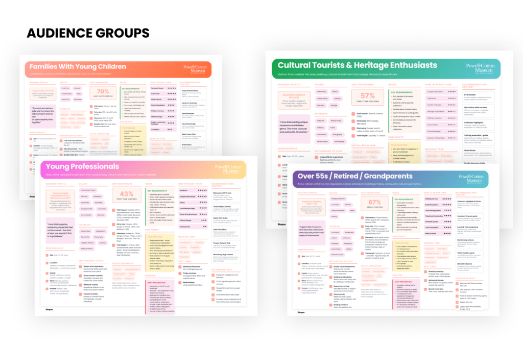
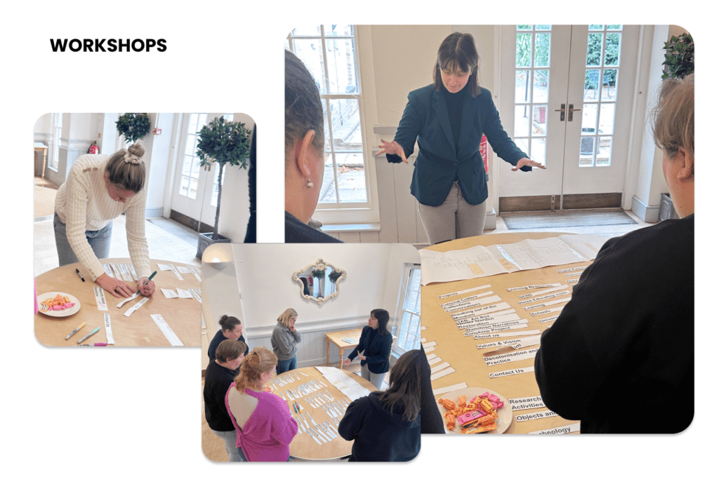
Audience research comes first: structured interviews, workshops, public engagement sessions that surface what different people need, feel and expect. Different audiences within the same organisation often want genuinely different things, and a brand has to work for all of them without losing coherence.
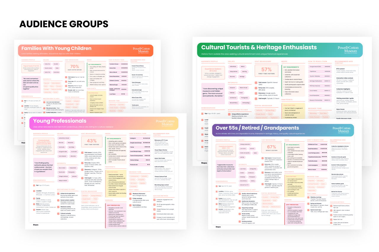
Our work with The Powell-Cotton Museum Trust is a good example of this in practice. The site contains three distinct visitor areas: the Museum, the House and the Gardens, each attracting visitors with different motivations and expectations. Understanding that upfront shaped everything that came after.
—
What are personas and customer profiling actually for?
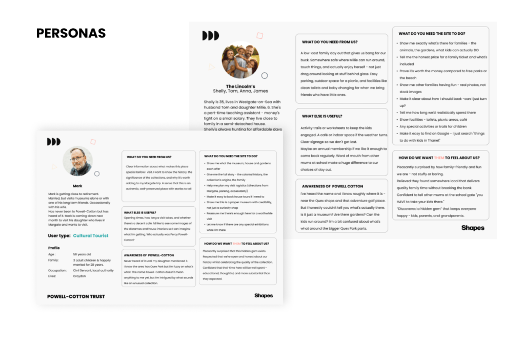
They’re the translation layer between research and design. Once you’ve gathered audience insight, you need a way to make it actionable. Personas give your design team something to test decisions against rather than defaulting to personal taste or what you are influenced by in what you saw yesterday.
Ideal customer profiling (often shortened to ICP) takes this further, getting specific about behaviours, preferences and the contexts in which people encounter your brand. A family visiting a heritage attraction on a wet Saturday afternoon has a completely different set of needs from a researcher visiting the collection for academic purposes. Both are real audiences. Both deserve to feel welcome and spoken to in digital and brand ways that speak to their interests and needs.
On the Powell-Cotton project, this profiling work helped identify where the existing brand was falling short, where content was duplicated, where gaps existed and where the information architecture wasn’t serving the people trying to navigate it. The card sorting exercise alone helped the client rationalise their website content in about ten minutes, which sounds small but had been an unresolved problem for years.
How does visual identity become a form of storytelling?
Good visual identity work starts with history, context and the specific character of the organisation. Colour, typography, illustration style, the relationship between a master mark and its sub-brands: all of these carry meaning, and the best brand systems use that meaning deliberately.
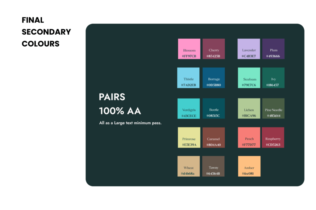
For Powell-Cotton, the visual identity draws on Werner’s Nomenclature of Colours, a historical colour classification system that connects directly to the museum’s natural history collections. The illustration bank incorporates both sourced historical material and new hand-drawn work inspired by drawings from the Powell-Cotton family. These are a way of encoding the organisation’s history into its visual language so that the brand tells the story even before a single word is read.
The result was a master logo with three distinct sub-brand logos, each sharing visual consistency while reflecting the individual character of its area. AA accessibility standards were met across all digital and print applications, often exceeding AA and hitting AAA where we could on contrast ratios.
—
Why does this matter more now than it did five years ago?
Two reasons. First, the volume of visual noise has increased substantially. Organisations that looked distinctive in 2019 can look generic now because the design tools available to everyone have made a certain level of polish accessible without requiring any real thinking underneath it. Standing out now requires more depth, not just better (or faster!) execution.
Second, audiences encounter a brand across more channels and contexts than they used to: a social post, a wayfinding sign, a website, a printed programme. Coherence across all of those touchpoints signals credibility. The Powell-Cotton rebrand generated compliments at UK visitor attraction gatherings shortly after launch, a reasonable signal that the work landed as something genuinely distinctive rather than just competent. Something thats important to us here at Shapes.
Organisations investing properly in this process are building brands that compound over time.
A well-researched identity, applied consistently, gets stronger with every new piece of collateral, every new campaign and every new audience interaction.
—
So what should you actually do before briefing a designer?
Start with the questions that make most people uncomfortable: who is this actually for, what do we stand for that’s different from our nearest competitors and why would any of that matter to the people we’re trying to reach?
Write down honest answers. Then find out whether your audiences agree with your self-assessment, because they often don’t. Run user research, engage with your actual customers (I know – scary right!) The gap between how an organisation sees itself and how its audiences experience it is usually where the brand work lives.
Give yourself time for the research phase. The organisations that rush it come back three years later saying the brand never quite felt right. It usually didn’t, because the process stopped (or started!) at the visual layer without doing the thinking first.
The Powell-Cotton Museum project is a useful illustration of what’s possible when you commit to the full process. A 31% year-on-year increase in average page engagement time almost immediately post launch, A 38% increase in new enquiries and a 30% increase in organic keyword rankings followed the rebrand and website redesign. Those results come from a brand and digital presence built on genuine audience understanding.
—
Start a brand project built on the right foundations
At Shapes, we run the full process: from audience research and personas through to visual identity, accessibility-compliant design guidelines and physical wayfinding. If you’ve got a brand that’s drifted, a new organisation that needs a starting point, or a heritage institution that needs to connect with modern audiences without losing what makes it worth visiting, let’s have that conversation.
Get in touch and we’ll tell you honestly what would make the biggest difference for your project.