


Client
Powell Cotton Museum Trust
Services
Brand, Web, UX, Print signage
The Results
“HUGE thank you for all your hard work and support in getting the website designs, logos, infrastructure and all the other behind-the-scenes work in place for going live. We are absolutely delighted with our new brand, logo, marketing materials and website.”
Sara, CEO, Powell-Cotton Trust
The Powell Cotton Museum Trust were looking for a brand and website that represented them.
We ran various brand workshops, stakeholder and public interviews and built website user journey plans with their core team and trustees, forming a brand that roars!
The brand has been such a success that the team are often been complimented on the new brand and website at other visitor attraction gatherings across the UK.
31
%
YoY increase in average page engagement time
38
%
YoY increase in new leads
30
%
increase in organic keywords ranking in Google


Know your audience
We ran our audience and persona workshop to uncover all the thoughts, needs and feelings of the audience to help shape the website and brand. This uncovered some wonderful gems of insight.
Card Sorting
We used a technique in which we collated the whole website and asked the client to get rid of any unnecessary or duplicated content and any gaps. This helped the client to think really simply (and quickly – they only get 10 mins!). As a result this activity surfaces the key and most important things to include in their website and brand.
The Powell Cotton Museum Trust team spent an afternoon with Shapes unpicking all of these things and we came out with a refreshed IA and direction for missing content.
Creating a brand family
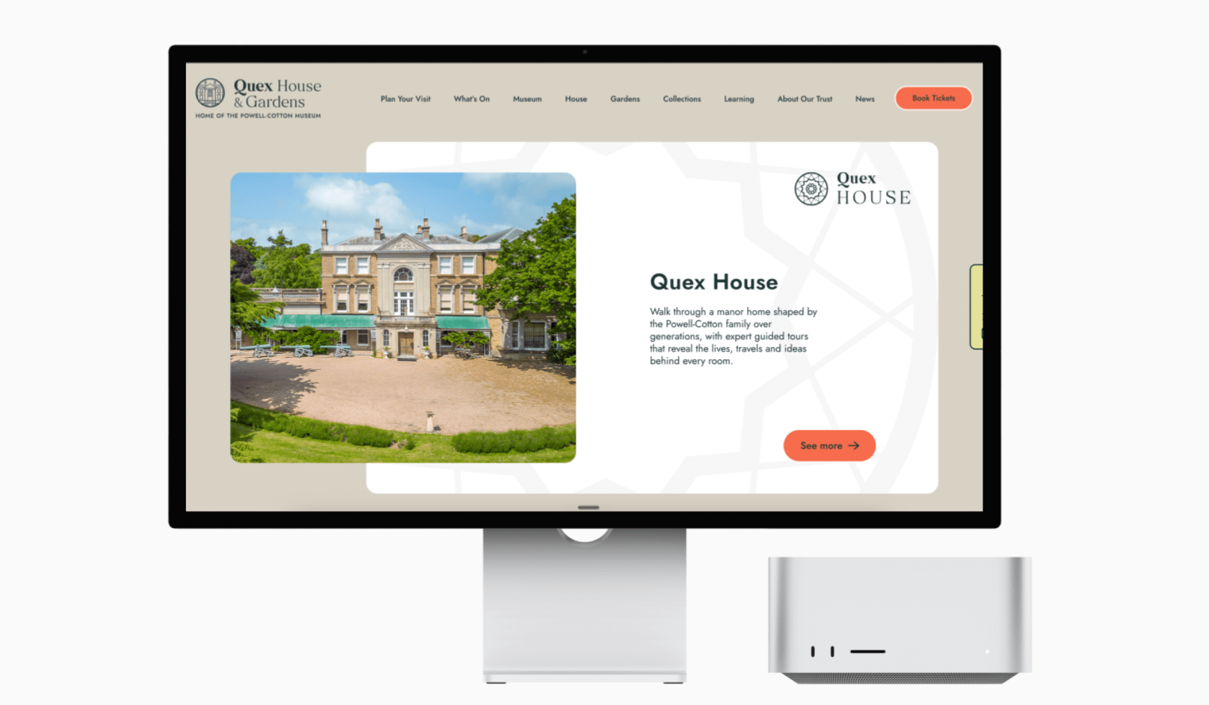
The Powell Cotton Museum Trust covers three areas for visitors to enjoy; The Museum, House and Gardens.
Through research and public engagement, we led the trust’s team to a new brand identity system. It was clear that the ‘Quex’ name is synonymous with the local experience of the Powell-Cotton Museum, so we brought that back to the front of the name. The new brand needed to be versatile to work for all areas of the trust whilst promoting individual identities, something the old brand didn’t do as well.
A new master logo was created, and three distinct ‘sub-brand’ logos were designed that all shared the same visual approach, each with their own nod to shapes, elements or stories within each space, but with a consistent feel.
A historical past, and modern future
A large part of the original brief was to try to capture the wide range of natural imagery and lean into the approach from Werner’s nomenclature of colours to showcase the fantastic collections that the trust has. A feeling of inspiration and learning was a key goal whilst remaining sincere to the collections past.
The brand had to be structured for easy navigation both on site in person, and online. The design balances warmth and heritage with modern usability, helping the museum connect with new audiences while celebrating over a century of history.
Holly
#1B3233
Fountain
#8DE3EE
Coral
Our leading accent
#F76C4D
Limestone
#D6D2C4
Chalk
#F1F1F1
Colour contrast accessibility
We provided AA standard for all colours and guidelines of usage and accessibility standards.
Ensuring the site met AA wherever possible was important to the team at the trust, and this was realised wherever possible.
We produced pairs of colour pairings for various design use in print and online, as well as a suite of core colours and secondary colours, with guidelines of use for all of them, to meet AA standards.


A fun and timeless visual language
We creating a bank of natural and contextual illustrations from both sourced and hand drawn versions from the team that can be used throughout the site and in print materials. Some of these take inspiration and direct links from the drawings of some of the Powell-Cotton family over the years.
The illustrations frame much of the new site and individual items, as well as a collection of illustrations we created for various more general content pages and the tickets system.


Physical signage & wayfinding
Our work reached way beyond just brand definition and digital as Powell Cotton Trust asked us to help implement the new brand into their wayfinding and core signage. The old brand was everywhere, but also looked physically dated, so just in time for their reopen in February (for the centenary year!) we managed to design, source and install all the print signage for all three areas.

Experience better
Get your website, socials, brand & marketing activity in shape with our team